Blog
One Simple Tip To Increase Click-Throughs On Your Call To Action Buttons

Call to actions are used in websites hoping to garner a certain response from the user. There are many ways to create call to actions, but one of the most popular ones are buttons.
Call to action buttons can include a variety of different things. Buttons can say things like “Buy Now”, “Sign Up”, “Get Started”, or anything else.
The goal of these buttons is for a user to take action immediately by clicking the button. Often times, call to action buttons can lead users to purchase something, sign up for something, or even fill out a form (lead-generation).
Regardless of what the purpose may be, there is one easy trick your website can utilize to immediately increase click-throughs on your call to action buttons.
The Wrong
Color plays an extremely crucial factor in click-through rates for your call to action buttons. Often times, website designers do not specialize in marketing. Thus, your website looks great, but doesn’t do an effective job in converting users into sign-ups or customers.
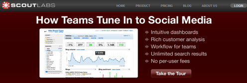
Most people would agree that the website above looks absolutely great. It has a nice design, it’s easy to understand, and it’s clean.
However, this website has a HORRIBLE call to action button. The goal of their call to action button is to get users to take a tour of their product and hopefully sign up with them after.
This website was designed from a web designers perspective instead of a marketers perspective. The “Take the Tour” button is engulfed within the maroon background and doesn’t stand out very much.
Now we’re going to look at the simple trick this website or any other website can use to drastically increase click-throughs on their call to action buttons.
The Right
Color choice is everything when designing call to action buttons for the user. Your call to action button has to stand out (in a non pretty way).
Typically, your websites goal is to sell products, generate leads, or create sign ups. Sometimes the prettiest websites have the worst conversions rates because of this reason.
We’ll use my website as an example to show you how I increased click-throughs with my call to action bar.
On my website, my call to action bar can be found at the very top of the website. It’s got a bright orange background. Ugly? Yes.
Works? Hell Yes. My click-throughs increased by over 100% after I changed the background color from beige to orange.
As ugly as the orange looks with my blue website, it creates a dramatic contrast. Everything is blue, but suddenly there is orange at the top of my website. The users eyes automatically wander there.
Call to action buttons/bars need impressions to successfully generate leads, sales, or sign-ups. Below are a few more examples of great call to action buttons/bars that work well.
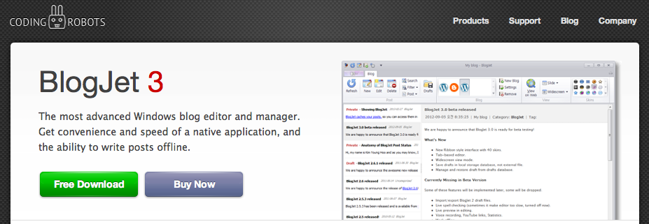
This website wants to evoke action from users by getting them to download their product for free. Their call to action is the “Free Download” button and that button stands out with the bright green color used.
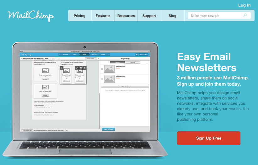
MailChimp hopes to get users to sign up for free on their website and does a great job of creating a call to action button that stands out. They go with a red button that matches no part of the website.
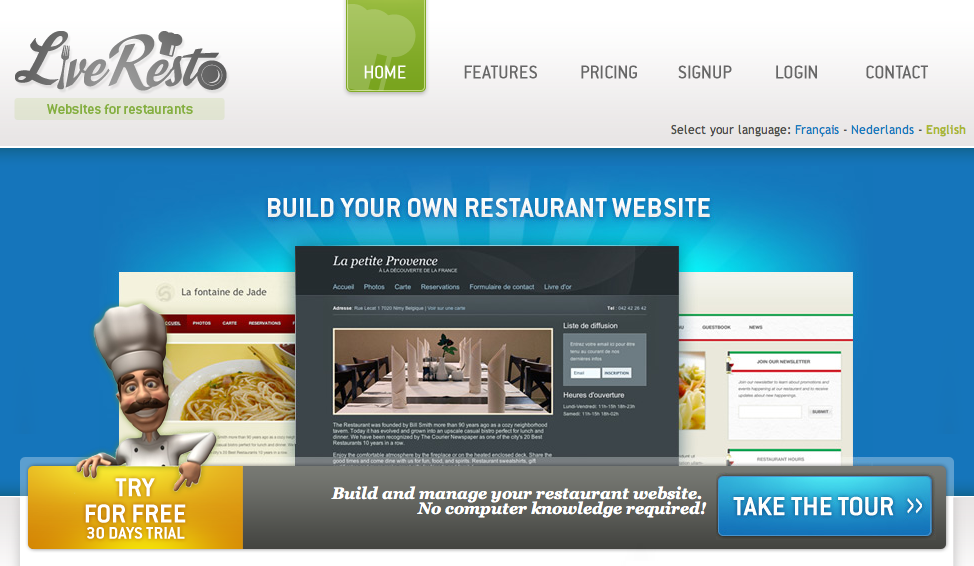
This website utilizes a bright yellow call to action button. They want users to try their product for FREE and their call to action does a great job of directing the users eyes to the bar below the slider.
The Tip
If you haven’t been able to figure it out by now, the simplest way to increase click-throughs on your website is by changing the color or style of your call to action button.
Look at your website and create a list of colors that have not been used anywhere on your website. Then, play around with the list of unused colors to see which color stands out the most.
Typically, the ugliest combinations make the best call to action buttons. If your button is so ugly that users can’t help but look at it, you’re on the right path.
Conclusion
This is one simple tip to increase click-throughs on your call to action buttons. Share any other tips and suggestions you have to increase conversions on call to action buttons.
photo credit: lastquest via photopin cc
- Most Popular
- Jeet's Favorite's


